|
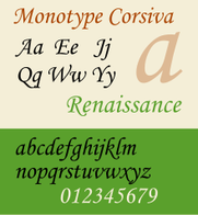
Final updates are coming along nicely. Before I can order the final proof, Doug is hard at work finishing the formatting for the cover. But isn't the cover already finished you ask? That's a very good question and I'm glad you asked it. You see, formatting for a finished book cover is a little trickier than it looks. You have to produce a single image that includes back cover, spine, and front cover, and which spills just slightly beyond the official size, what's called "bleed". You have to measure very precisely to account for the exact number of pages or it will all print askew. Meanwhile, I have been hard at work mimicking the superior skills of a typesetter. What's a typesetter, you also ask? 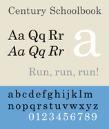 Exactly. If a typesetter does their job, you never even notice. They understand sans-serif lettering and when and where not to use it. They consider weight, slope and x-height among so many other seemingly trivial details to make sure the text not only reads smoothly, but looks right on the page, is easy on the eyes, and subtly and subconsciously conveys the attitude and atmosphere of the content described within. For Twentieth Century Eve, we made use of a couple different fonts. I chose Century Schoolbook for the main body. It's a relatively standard serif font that doesn't make your eyes bug out of your head after staring at whole pages of it. If all goes well, I'm hoping it will have a medium to light weight on the printed page, thin and trim and not too inky. I chose the sans serif Century Gothic as a complimentary font for the headings and page numbers. The two fonts look good on the same page, not surprisingly, since they are basically different styles of the same font. But I needed something more. So I chose the fun and playful Monotype Corsiva for the titles, sub-titles and concluding remarks which open and close each story. Then of course there's that beautiful modernist font for the cover that Doug found. Wish I knew the name of it. Great choice. A fourth font is usually a pretty risky move, but it adds such a great element of professionalism (that I need as an amateur). Indeed each of them contributes to the overall atmosphere and reinforces the aesthetic I've tried to produce within the writing itself. All in all, we have a nice package coming your way! Unless you plan to go the e-book route, in which case Amazon filters everything into their own formatting (sadly out of my control), but at least it is safely professional and easy to read. So keep holding your breath, my future fans, because Lorna will be here before you know it!
0 Comments
Leave a Reply. |
Captain's Blog
|
 RSS Feed
